Rayon V2
A new software for a new stage

We are releasing today Rayon V2 ; this new version is the result of a 6-month revamp of our software, a time during which the very nature of our tool has quickly matured.
Excessively demanding users have given our team the chance to aim high. Consequently, V2 is Rayon’s best attempt to date to become the fastest software to create perfect architectural drawings. This article offers a glimpse into the five main components that constitute this new milestone.
V2 Interface
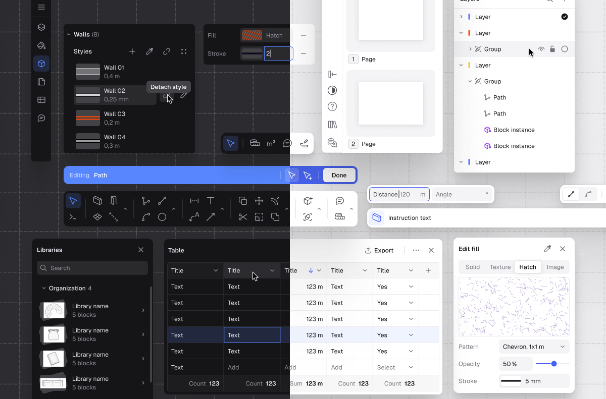
Starting from what is most visible, our software interface has become crisper, denser, faster. In essence, a lot of care has gone into raising the bar in three key directions.

Speed — Rayon’s V2 interface was rebuilt from the ground up to ensure speed of access. A single principle led our team’s thinking: we wanted to create a software that ‘gets out of the way’ for our users, so that small frictions do not ever interrupt their creative flow. This materialized into a large refactoring of the UI, as more options and tools were brought back to the surface of our software, instead of being tucked away. From substantial changes to smaller features, a lot has been added to strengthen speed of access: a new command line to trigger commands faster was added, the ability to call every single action through shortcuts was improved, the UX of the toolbar was upgraded, we increased users’ ability to batch edit things, the structure of lists in panels got revamped to speed up searching and browsing through assets, etc.
Clarity — This new iteration also prioritized clarity. The idea was to prefer setting in stone a few opinionated conventions rather than offering endless customization possibilities of the interface to our users. On one hand, concepts that belonged together were regrouped into clearly defined zones of the interface (properties panel on the right, resources and lists on the left, toolbar at the bottom, period). On the other hand, we have made concepts that yesterday lacked clarity as crisp as we possibly could. Styles are from now on either implicit (not saved and applied on the fly by the user) or explicit (saved and applied at scale by the user). Actions and commands are much more generic, so as to be universally applicable across the board and avoid odd exceptions to the editing experience. The notion of active (active layer, active style, active canvas, etc) has been harmonized. The property panel has been restructured into proper sections and subsections, so as to clearly express both scopes and hierarchies.
Precision — Finally, we invested time in creating a sense of increased precision. Talking with users, it became clear, early on, that trust would come with building a more accurate drafting experience. We started by improving on-canvas interactions by ensuring a more reliable snapping experience, having more consistent cursor effects and states (hover, selection, color of entities), providing a wireframe mode allowing to turn everything into hairlines for maximum accuracy, switching from presets of values to continuous inputs, etc. At a deeper level, our users’ request for precision expressed yet another, less immediately obvious aspiration: people were looking for a professional tool, one that would reflect their expertise, their standard of care. Consequently, with V2, the general aesthetics of the app switched gears, embracing a much denser, more compact layout, offering a dark mode, using a crosshair cursor for point insertion, etc.
Speed, clarity, precision: these three tenets of Rayon’s new interface constitute from now on the new identity of our software. One that we will persist across all new features, as we now understand how much these values matter to expert interior designers and architects.
Professional-grade Layouts
Architecture does not stop when the drafting phase is complete. Translating a given design into a proper document set or a carefully laid out presentation is the unavoidable final step of almost any project. In consequence, with V2, we chose to place some extra care on delivering a best in-class layout experience.

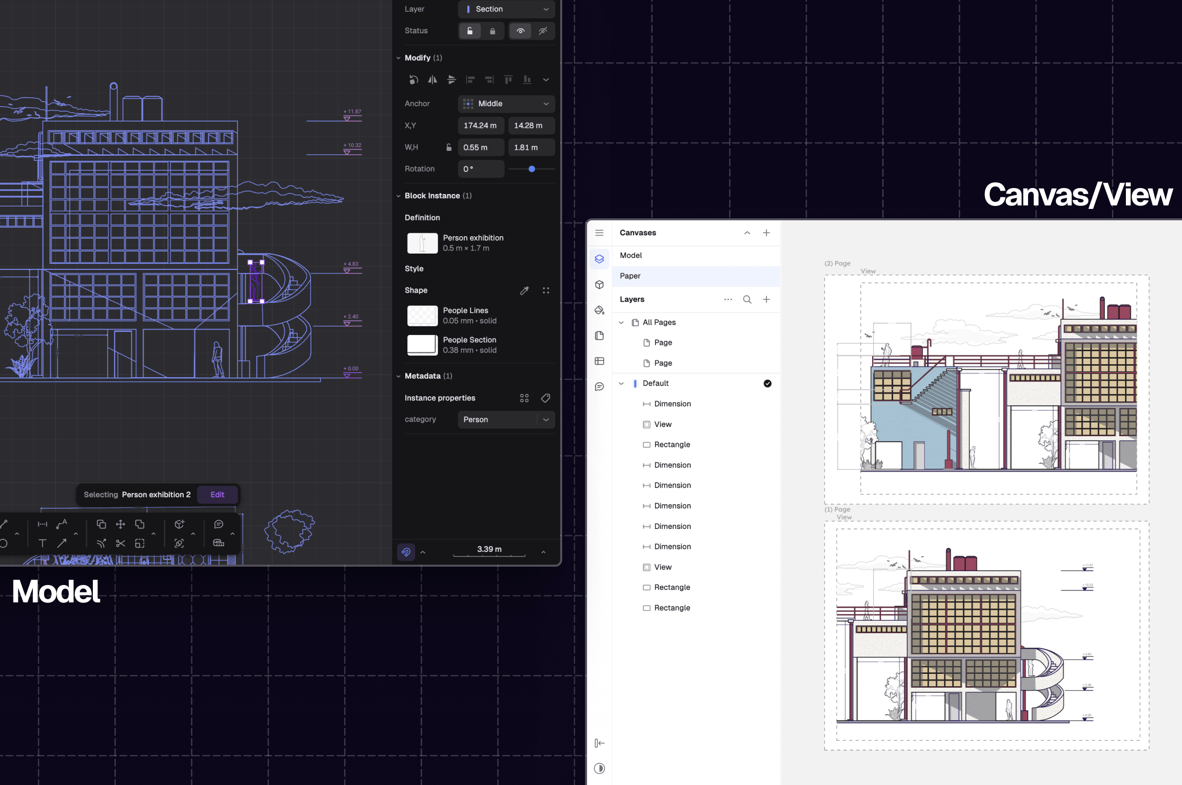
Canvases — Everything starts from designers' ability to separate the work of each phase in their drawing: model on one end, page layouts on the other. That is why V2 introduces canvases. Paper canvases, Model canvases: different spaces in the same model now allow our users to split between building scale work, and document set crafting (more on canvases in our documentation here).
Views — Yet another feature is key to allow users to create truly comprehensive drawing sets: views; that is, windows onto their drawing, referencing it, while allowing them to tune the style, visibility, crop and size of things within these windows. With V2, we invested a lot of time in crafting views and their editing options, as we know their importance for designers (more on views in our documentation here).
The annotative layer — Annotation leaders, block leaders, richer dimensions: the overlay of annotative information that is usually added on top of drawing sets is essential to interior designers and architects. It is how designs are turned into tangible information, and document set become communication tools among stakeholders. With V2, we made sure that Rayon could support the important classes of annotations, while enriching the ones already existing since V1 (more on annotations in our documentation here).
Canvases, views, annotative layer: this feature set does not represent in itself a breakthrough. It is rather a table-stake, a must-have for any decent architectural software. However, the “devil is in the details”: our hope is that the way we chose to materialize these features will prove faster, more accessible and playful to users, compared to how they usually come across in other traditional offerings.
Performance = Trust
Yet another decision behind Rayon’s V2 has been to invest in our software’s ability to power very large projects. If CAD files are known to be gigantic, and designers for having very limited patience for laggy software experiences, we had to ensure that Rayon’s core engine was able to balance these two imperatives. That is why V2 has meant building a brand-new rendering engine from scratch. This sunken part of the Rayon “iceberg” is an essential building block of this new iteration, worth explaining in a few words.
Rayon's renderer operates at the edge of what is feasible today in the web. In essence, this new generation of renderer is the result of a handful of opinionated technical decisions.
Multi-threading — V2’s new renderer taps into users’ computer hardware, so that all available cores of their CPU are used to process the model’s geometry before it is being sent to the GPU to render. That rendering strategy, also called “multi-threading”, allows the resulting display performance to be much smoother for our users.
High quality antialiasing — Rayon's renderer calculates the exact area of pixel covered by each shape or shape segment. This technic, known as analytical antialiasing, is at the practical limit of the quality achievable with typical vector graphics renderers, and one that we are glad to have embedded in our new engine.
Sophisticated memory allocation — A new, custom memory allocator was also written specifically to be used in the renderer. This technic allows fast and lock-free memory allocation, even when using multiple threads at once.
Single draw call — Another decision, taken early on when deciding to craft Rayon’s new renderer, was to allow for the entire model to be rendered in a single command issued to the GPU, no matter how complex the model is.
High precision — Rayon renderer is also using higher precision numbers than traditional vector graphics renderers for processing models. Anything from tiny details to extremely large structures are seamlessly rendered thanks to this technic.
Web-first renderer — Above all else, the major challenge we faced was to make this new renderer run on the web. Concepts made for more advanced platform were repurposed and trimmed to be able to run on WebGL2 and Wasm. As a result, Rayon can from now on run its engine across many different setups from the latest browser generations, to much older, deprecated versions.
Rayon V2’s renderer is in fact just a stepping stone towards even greater performance standards in the near future. As it was built with extensibility in mind, this new engine gives our software the ability to expand its feature set and its performance much further, to the benefit of our users.
Resources
From the early days of Rayon, we have witnessed how much catalogs of resources (furniture, symbols, objects, styles, etc) are a necessary complement to the more generic architectural drafting experience. That is why Rayon has been building libraries since its inception. With V2, we chose to double-down on this dimension of our product, scaling our libraries to tackle new use cases, new vantage points, and adding new, important formats.

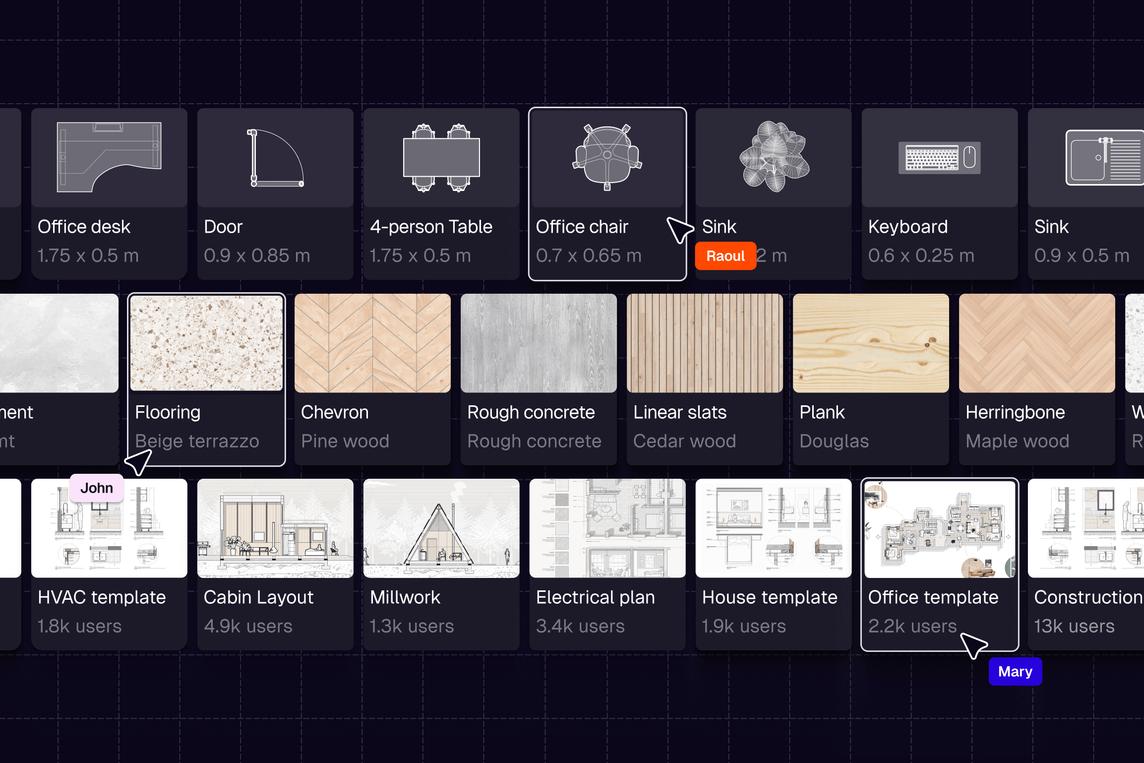
Block libraries — With V2, Rayon’s block libraries have grown significantly. From roughly 1000+ blocks a year ago, we now have scaled our repositories to 4500+ items. With this new batch, we have sought to tackle more standards (EU standards, US standards, etc), to offer more choice for some of our existing collections (doors, symbols, people, etc), to address new use cases (items for stores, for page layouts, for gyms, etc). More importantly, with V2 we have introduced the block family feature: a single item can now be published and used in its different potential versions. Thanks to this new feature, most of our items are today available in 3 distinct vantage points (top, side, front). More about block libraries can be found in our documentation, right here.
Style libraries — Leveraging the logic built initially for blocks, V2 comes with new style libraries. 1000+ hatches and textures are now available in-app, and reinforce users’ ability to quickly stylize drawings in Rayon. More about styles can be found in our documentation, right here.
Templates — Finally, with V2, Rayon addresses designers' need to define, capture and reuse entire drawing standards. Either to get a team aligned on a certain drawing aesthetics or brand identity, or simply to quickly bootstrap the setup of a drawing at the beginning of a project, or more generally to find some inspiration, templates play a central role in the architectural culture. That is why V2 has introduced in Rayon the ability for users to save and publish drawings as templates. At the same time, our team has built a vast repository of publicly available templates, to address the main space typologies or document sets our users design daily. As of today, more than 150+ templates are available in-app. More about this new feature can be found in our documentation, right here.
Blocks, styles, templates: if these repositories are today truly useful to our users, their relevance is called to grow even more: in the next few years, massively scaling our catalogs will be a key dimensions of the growth of Rayon’s ecosystem.
On Depth
Finally, in parallel to the major additions described above, building V2 has been about something more prosaic: a general deepening of our existing feature set. From the commands, to the software’s import capabilities, all the way to model versioning, V2 has been an app-wide upgrade of what was already in place. An increase in depth that stemmed directly from the expectations of our users.

Settings — Starting with the very settings of Rayon’s models, V2 brings countless tiny quality of life improvements. The management of units across models is from now on much more consistent (assigned at the canvas-level and overridable at the style level), the formatting of distances and areas displayed on the canvas is finally tunable, the navigation mode (trackpad/mouse mode) and command access mode (command line/shortcuts) have been improved to allow users to choose their preferred way to interact with their model, etc.
Drawing experience — Rayon’s drawing experience has also significantly improved. New editing commands (Align, Boolean) have shipped to round up the existing command set. The annotation tool box has been completed by a new leader command. Besides new command, existing tools have received new, much-awaited modes. To only name a few: direction mode and multimode for the dimension command, arc mode for the arrow, the wall and the zone divider commands, the block mode for leaders, etc. New behaviors have been added to complete the drafting experience: walls can now be used in groups and blocks, walls can finally have an irregular shape while trim/offset/extend can be applied onto them, command argument values are now memorized, select similar has been introduced, etc.
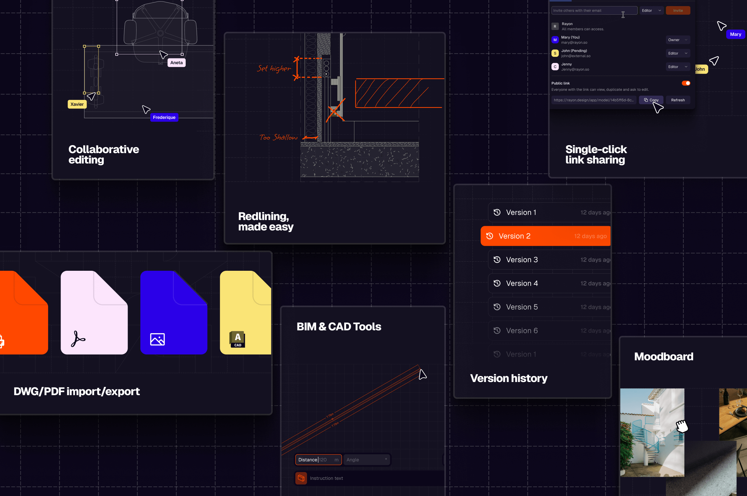
I/O — The import/export to and from Rayon have been significantly improved too. Mindful of the importance DWG/DXF for our users, the export and import in that format have received extra care. The support for the content of that data format has been widen at import, while the consistency of the export has been upgraded. PDF export has also gotten much more robust, as many issues dating from V1 have been ironed out.
Versioning — Last but not least, V2 has been the opportunity to leverage one obvious advantage of online editing: versioning. Every Rayon model is today constantly saving a backlog of previous versions, accessible at any point by editors. More about versioning can be found in our documentation, right here.
The list could easily be continued. The successive product updates of the past 6 months (May, June, July, etc) are a testimony to this general rise in robustest and depth. The time and resources spent on them is a direct reflection of our team’s commitment to raising the bar of our software’s quality, across the board. A commitment that will continue, well after V2 has shipped…
A Tipping Point
V2 closes a chapter: one where the tentative scaffolding provided by our V1 got crystallized into the definitive backbone of our software. It is this core that we now intend to firm up and build upon to become the best design tool for interior designers and architects.
In essence, this new version is our best attempt to date to reunite once and for all the 3 steps designers in our industry go through for every single project: drafting, stylizing, laying out. We hope V2 finally signals to interior designers and architects that the transition, away from the world of legacy software is not only a sound, rewarding strategy, but also an exciting perspective; a tiping point when the act of building can finally happen all in one place.